Matplotlib is a Python 2D plotting library which produces publication quality figures in a variety of hardcopy formats and interactive environments across platforms. – matplotlib
Within a Jupyter notebook, the data can be visualized with matplotlib. However, the size of the images has changed with a version of Jupyter or matplotlib. The images have become smaller. You can see this by opening and running an example notebook. Matplotlib displays the images smaller than in the example. Depending on the size of the data I want to display the graphic a bit bigger.
Stackoverflow of course offers help on this: How to make inline plots in Jupyter Notebook larger?
With the rcParams the figure.figsize can be defined:
matplotlib.rcParams['figure.figsize'] = [width, height]
Example
I have created an example using the Titanic data from the blog post H2O.ai AutoML Model in Java. I have executed the following code in a Jupyter notebook:
import pandas as pd
import matplotlib.pyplot as plt
%matplotlib inline
df = pd.read_csv('https://raw.githubusercontent.com/choas/h2o-titanic/master/data/train.csv')
max_age = int(df["Age"].max())
group_data = df.groupby(pd.cut(df["Age"], max_age)).count()["Age"]
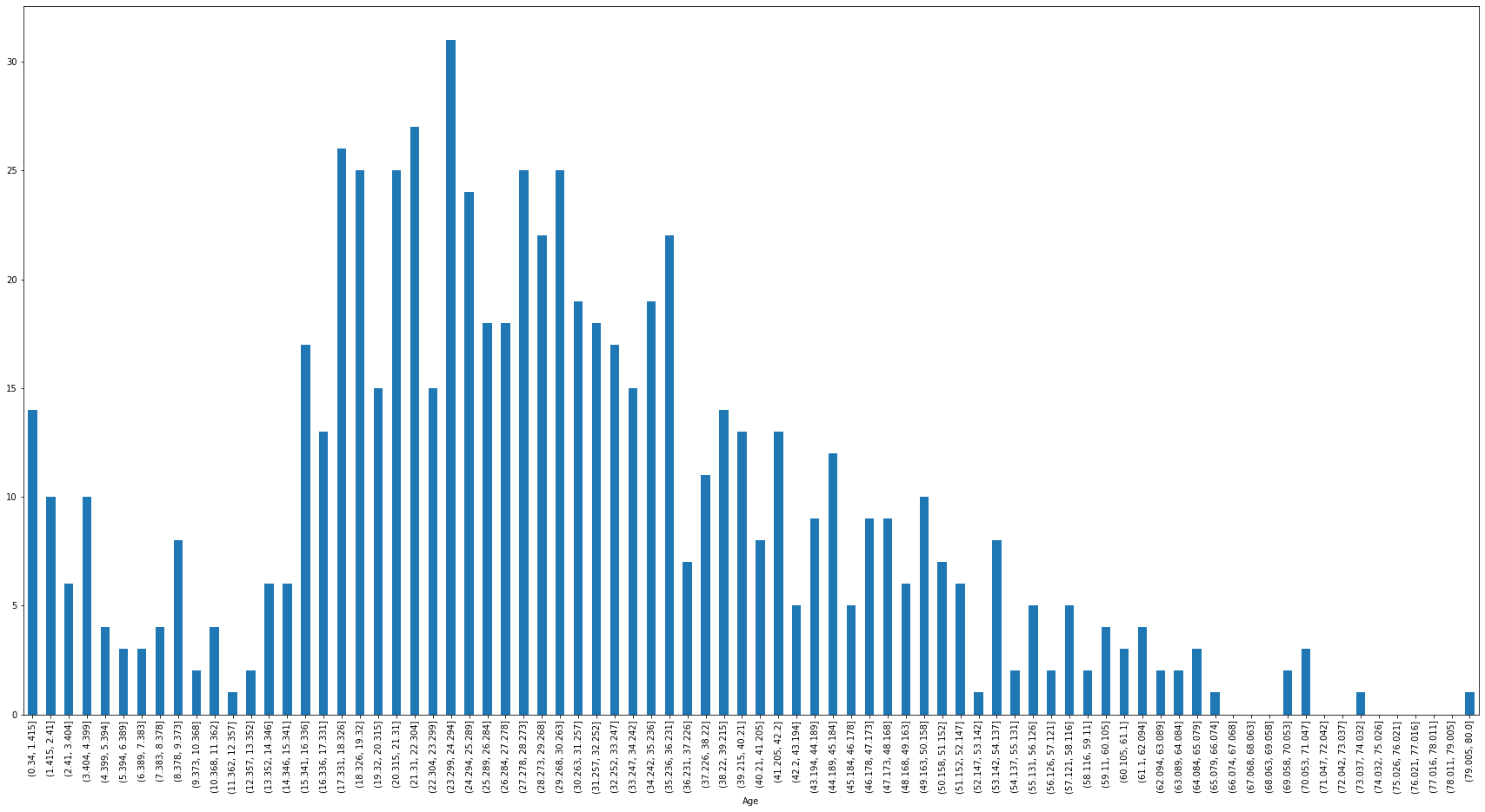
plt.rcParams['figure.figsize'] = [30, 15]
fig = group_data.plot.bar()
plt.show()
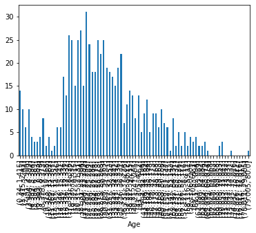
First the data are read and then the age data are divided into age groups. Afterwards they are visualized. The first graph shows the result if the figure.figsize is not set:
In the second graph I used the figure.figsize value as shown in the example. In the graph the different age groups can be read without problems:
Seaborn
There is also a solution for Seaborn: How do I change the figure size for a seaborn plot?